The Probus Organisation
The word Probus is an abbreviation of the words PROfessional and BUSiness, however, membership is not restricted to these two groups. It also embraces former executives of Government and other organisations, in fact, anyone who held a position of responsibility during their professional life.
Probus clubs provide an opportunity for retired professionals to attend regular meetings with like-minded people who appreciate similar interests and social standing. Probus is an organisation for active retirees who enjoy the camaraderie that belonging to this organisation brings.
Probus provides a support network for professionals when they retire, these clubs were initially started for men but over the years has seen steady growth in Ladies and Mixed clubs. Many clubs have extensive networking, social programmes, which include meetings with other Probus clubs, group trips, holidays, and involvement in community projects, etc.
The concept of Probus was born in the UK and has grown to be a huge success worldwide. One Australian gentleman said to Ralph Harper in the late seventies “Probus is the best export the UK has ever had”.
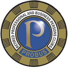
The Story of The Probus 'P'
Right from the outset and the original concept for a lapel badge, it became obvious that the“simpler the better” rule would apply. To be small, attractive, dignified, and instantly recognisable (as the Rotary Badge is, with castellated ‘cog wheel’ surround), including some Rotary-esque references, reflecting that it was a Rotarian who conceived the whole idea of “Probus”.
It was decided early on that the logo had to be based around a ‘P’ in a circle. ‘P’ for “Probus”, encompassed by a circle, representing the circle of friends and companions gathered together as a club. The ‘P’ had to be original (as was
Probus) and to fit inside the circle, to be rounded, pleasing, proud, and outstanding.
One glance at the finished design is not enough to reflect the many small improvements and alterations to that first original sketch.
It was also decided that an original character form was needed for the Probus logo. Typefaces used for the London Underground maps and motorway signs were commissioned especially for those projects, enabling them to be copyrighted. Having looked at the broad spectrum of available typefaces, it was confirmed that the Probus ‘P’ was an original.
The surround takes a strong influence from the high and low sections of a castle wall, with raised polished segments, bringing into relief the constellations. This is set within a complete circle to denote the strength of friendship and sense of belonging that must be a true and generous desire of every Probian badge wearer, to promote their Club with pride.
.jpg)
.jpg)